By Sebastien Hayez. Published June 22, 2024
History of ligatures, part 2/2
Part 1/2
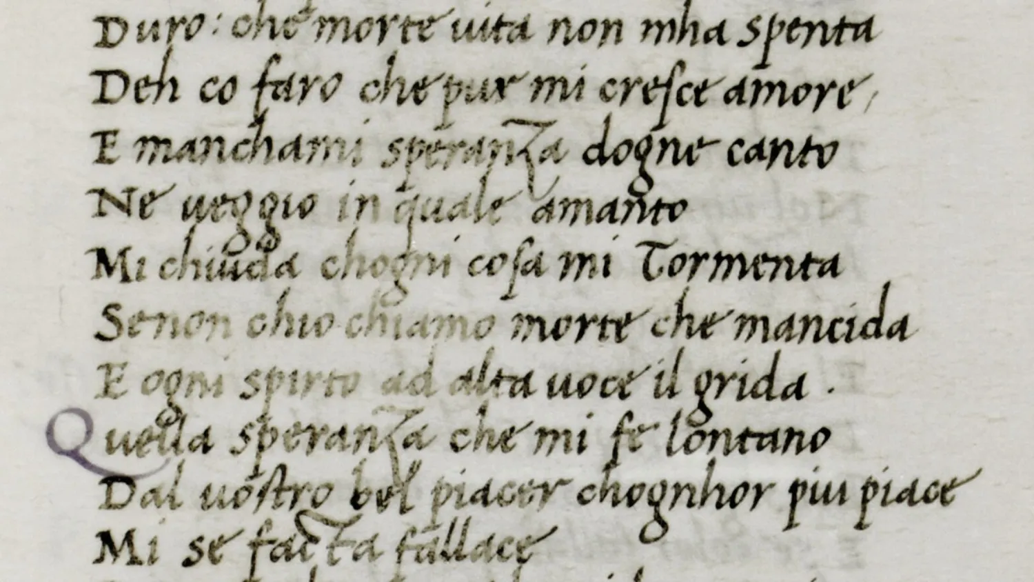
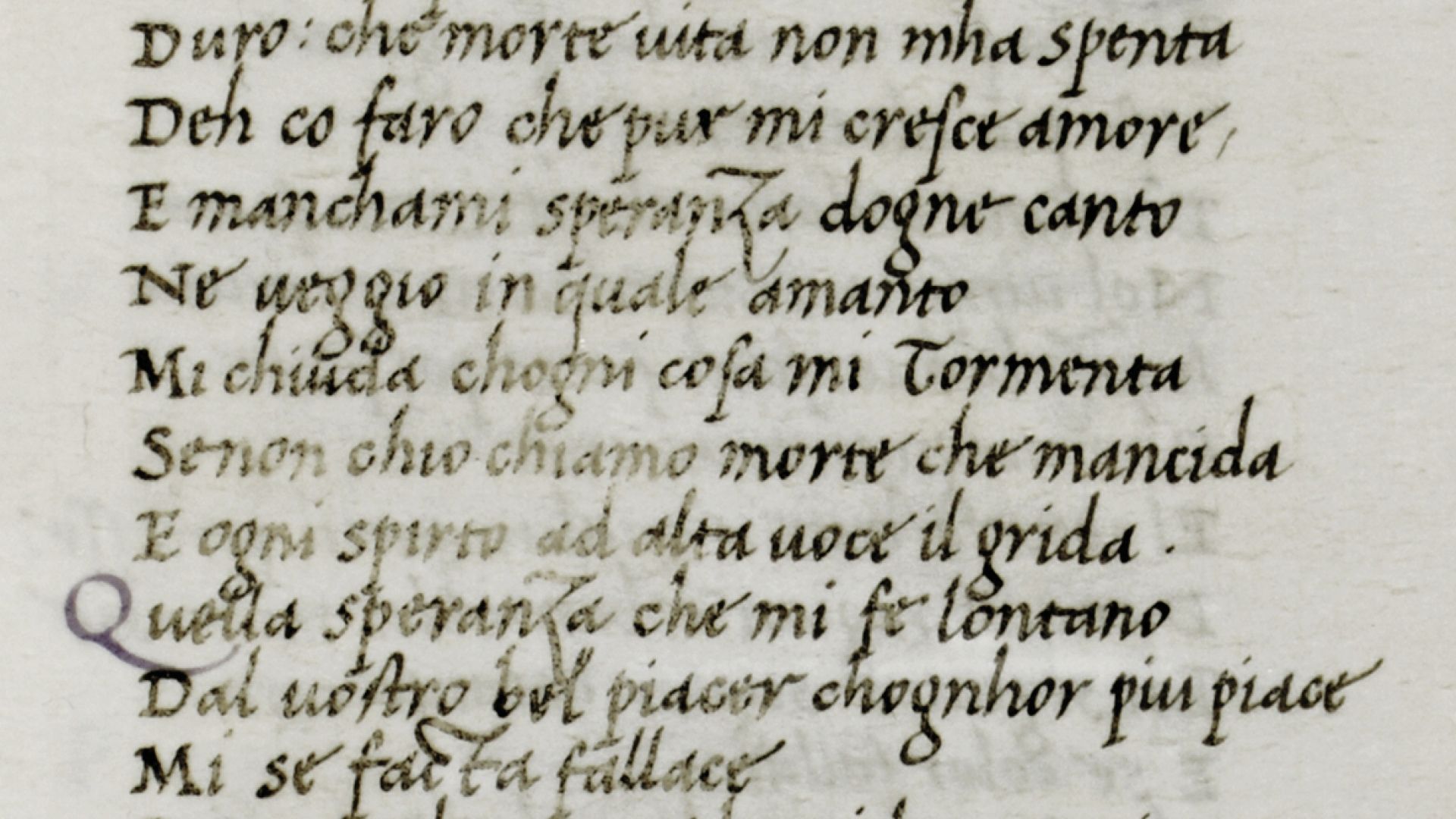
Italic ligatures: textual cursivity
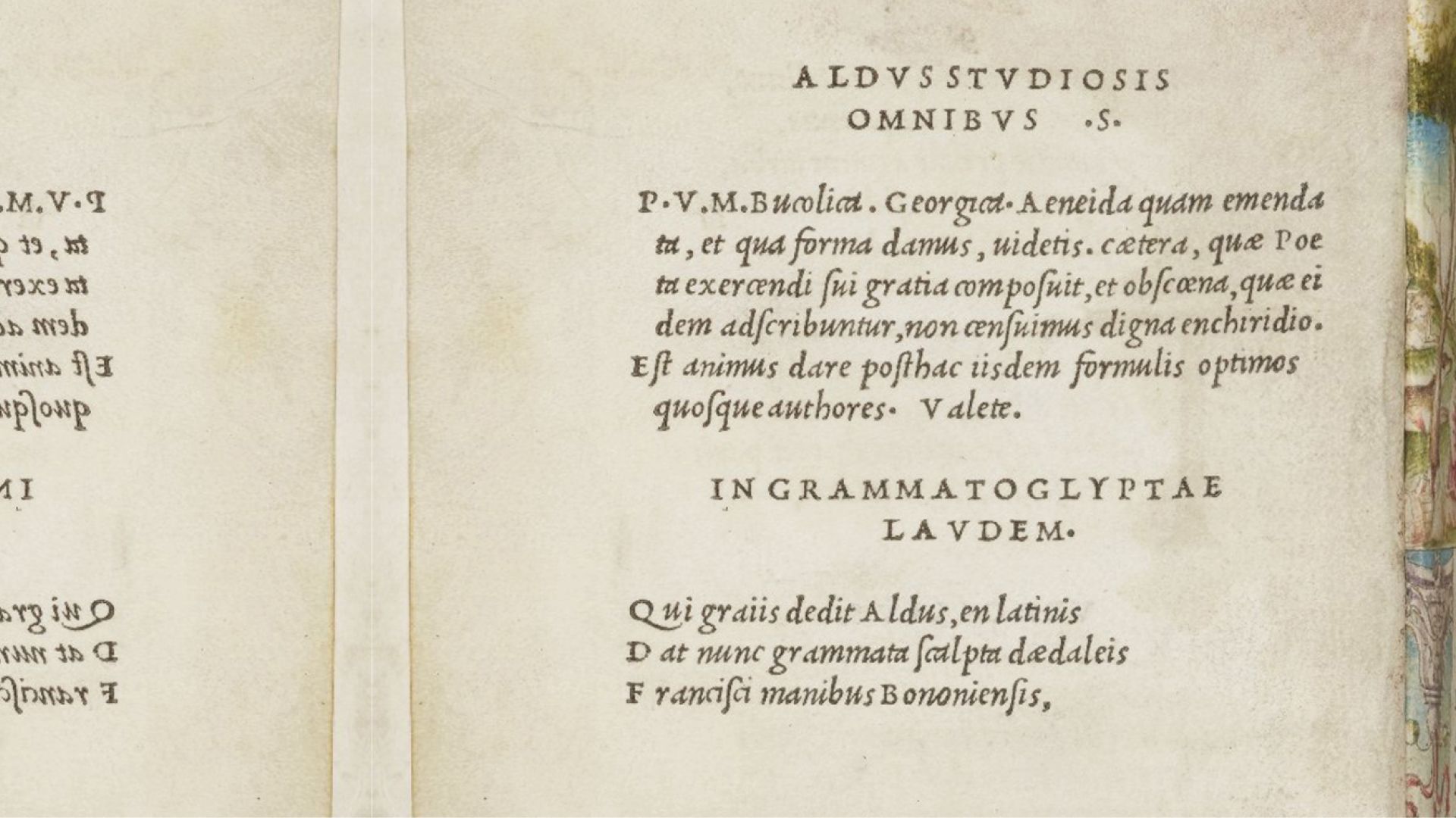
When italic typography appeared in 1499 under the impetus of Aldus Manutius (1444-1515) and engraved by Francesco Griffo (1450-1518), the aim was twofold: to reproduce the graphic style typical of humanist chancery writing, and to reduce the size of the letters in order to condense the text to an in-16 format, similar to our pocket books. This tour de force required Griffo to engrave 65 ligatures.
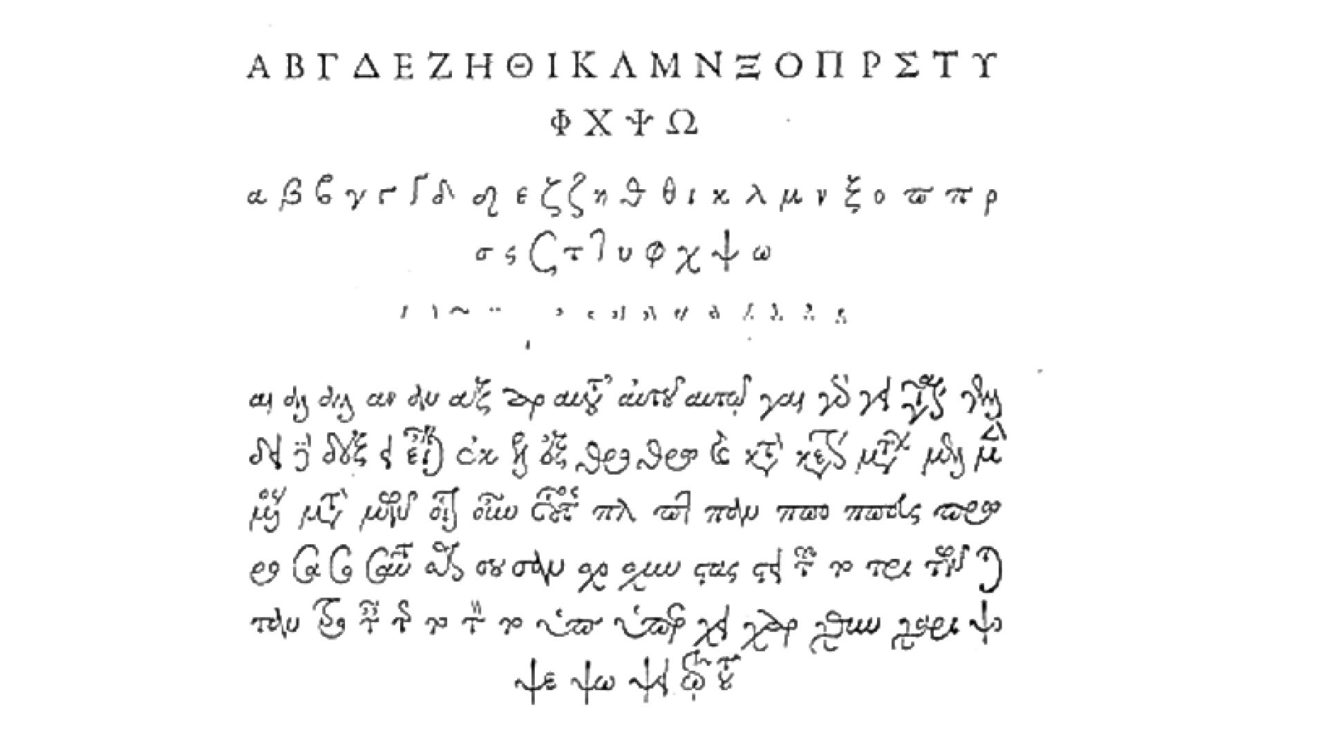
Other alphabets were not forgotten, and on November 2, 1540, François Iᵉʳ placed an order for a Greek typeface, in several sizes. Robert Estienne (1503-1559), the King's printer, turned to Claude Garamond (1499/1515 - 1561) to engrave the punches: the gros romain type set (16 points) was completed in 1543, the cicéro (9 points) in 1546, and the gros parangon (20 points) in 1550. Nearly 400 ligatures reproduce a set of letters that can also be used to compose numerous abbreviations.
However, this number tended to diminish with the italics that followed, proof that the desire to imitate the script was fading. From the Modern period onwards, typographic ligatures between capitals are virtually non-existent: reserved for titles, the economy of space is limited and the cutting of punches for this purpose proves too costly. Ligatures between lower-case letters, on the other hand, were frequently used. But when Italian engravers drew inspiration from Caroline to create the humanist Roman typefaces of the Renaissance, abbreviations and ligatures lost their presence. All that remains of this desire to reproduce the manuscript are the ligatures st, ct, sp and cp. The other ligatures, ff, fi, ffi, fl, ffl, are used to enhance the composition of the text.
The term ligature first appeared in France in 1680 . It was exported to England in 1693 and still designates a group of two or more letters joined together in handwriting or typography. The most popular ligatures are certainly the ampersand, symbolizing the Latin conjunction et, but also the German eszett, symbolizing the ligature of the letters ss or sz. As with Æ and Œ, these two ligatures operate as letters in their own right in some languages.
Forgotten ligatures: the restricted keyboard
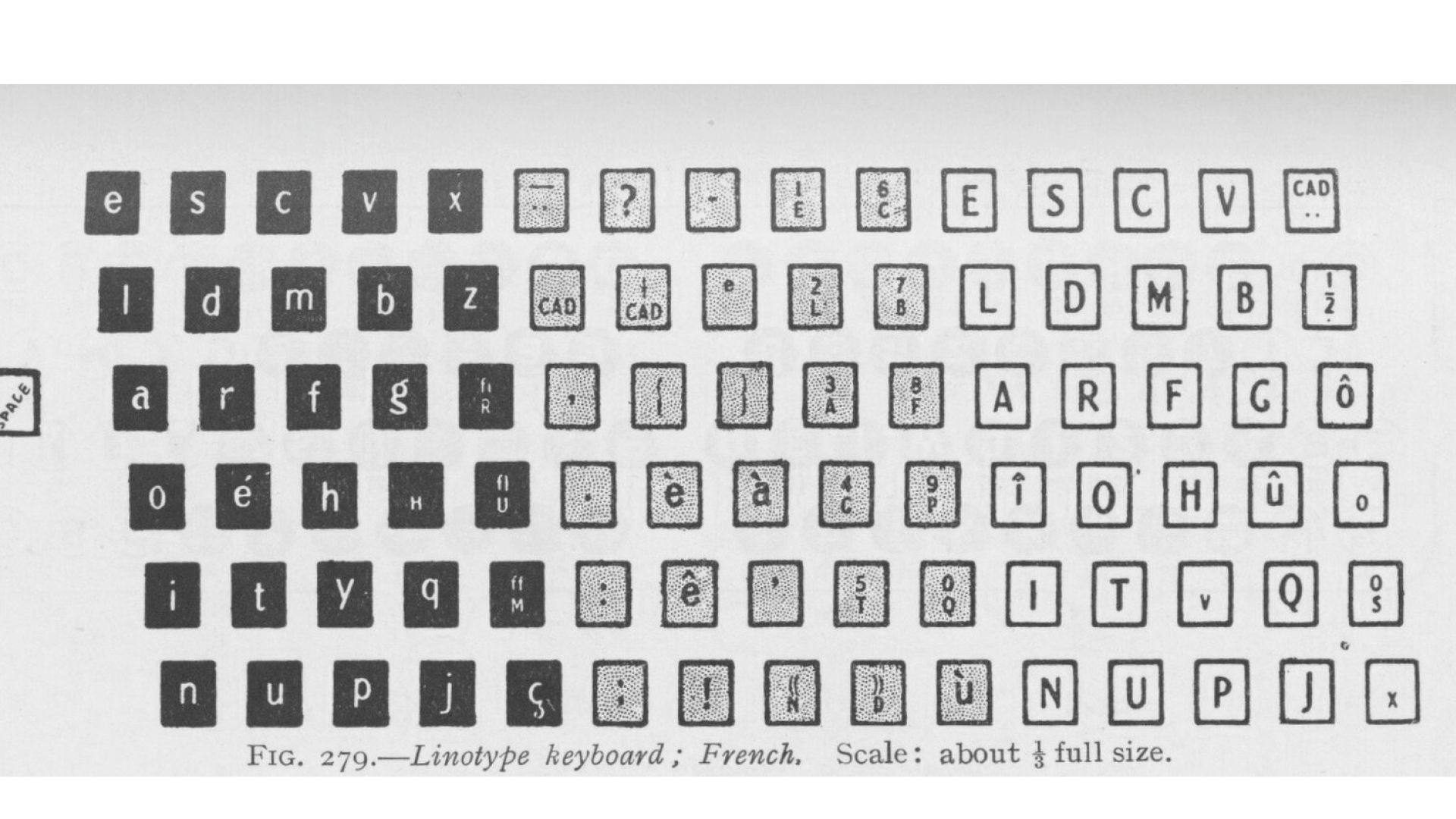
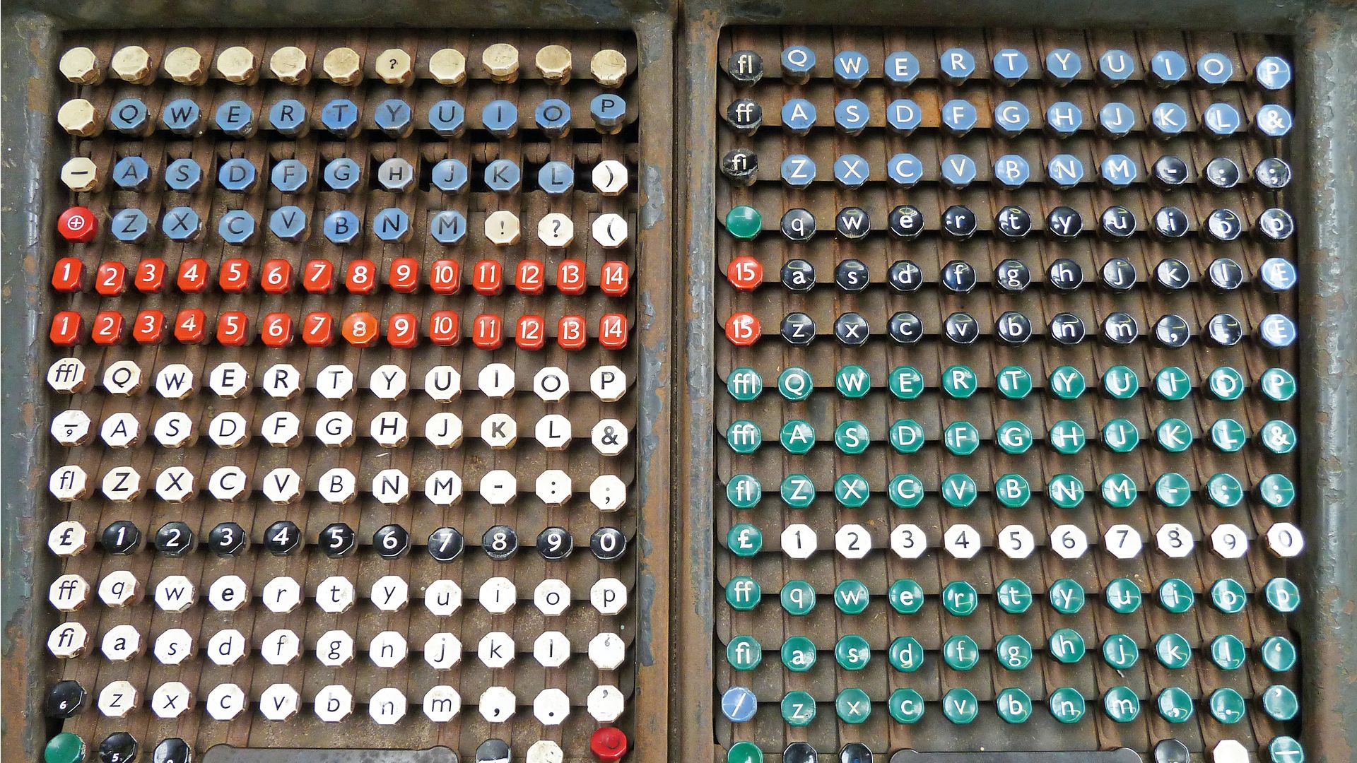
Mobile typography evolved with the mechanization of typesetting machines. Ottmar Mergenthaler's Linotype (1885) enabled text to be composed on a 90-key keyboard, which cast separate block lines. Tolbert Lanston's Monotype (1887), on the other hand, composes individual characters on a 276-key keyboard, first in lines and then in blocks. In the first case, no ligatures are available except for œ ; in the second case, , Œ, œ, Æ, æ, ff, fi, ffi, fl, ffl are the only ligatures available. This scarcity of ligatures is the result of mechanization in search of efficiency and ease of use. The process had already begun with typewriters featuring a reduced keyboard. Until then, the task of composing a text was carried out without any real awareness on the part of the writer. He or she was free to write with a free hand, embellishing each letter with his or her own ductus. The mechanization of text composition for letterpress printing encouraged the craftsman to become aware of the formal specificities of each letter that became a typeface. Typographic cases, then keyboards, clearly display the hundreds of glyphs available for the proper drafting of text in the Latin alphabet.
The natural evolution of printing involved a switch from relief printing to offset printing based on lithography, and from movable type to matrices in the form of photographic film. Initially, the Linotype served as the mechanical model for this new tool, replacing cast type with exposed film. With this in mind, the keyboard remained small, with only a limited set of ligatures.
Yet post-1948 American graphic artists and type designers drew on imagery inherited from the late 19th century to shape the graphics of future subcultures. In this exploited attic, ligatures are as much reminders of calligraphy as they are of ornamental splendor, set against the rigor of Swiss modernist graphic design.
Renaissance ligatures: photocomposition and Letraset
In 1968, Herb Lubalin (1918-1981) designed the logotype for Avant Garde magazine, founded by Ralph Ginsburg (1929-2006). After numerous trials, he designed a personalized lettering based on a geometric lineal like the Erbar (1922) or Futura (1927), except that he reduced the lettering spacing to the point of interlocking the letters. To perfect his logo, he slants the A and V to make them more interlocking, while the NT follows in the form of a truncated T on the left side of its crosspiece. The GA uses traditional Roman lapidary ligatures, bringing the two letters closer together.
Later, in 1970, Lubalin took over his logotype and developed, at the ITC foundry and with the help of his assistant Tom Carnase (1939-), a complete typography: capitals, lowercase, numerals and an extensive set of ligatures faithful to the original model.
On the other hand, marketing requires getting around the technical limitation of the input keyboard. The solution is simple: simply offer a film matrix sheet listing the ligatures, in the same way as the other styles (italic and bold) are on a different matrix from roman.
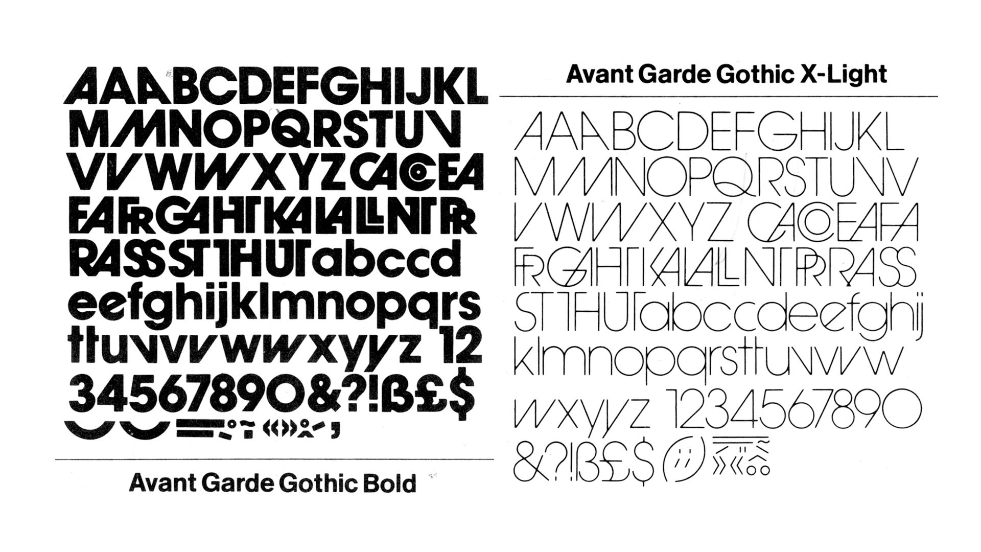
The success of the typeface lies not so much in its design, but more in the overall graphic rhythm provided by the extremely tight approach, as with Helvetica (1957), and the richness of its ligatures. The ITC Avant Garde became the prototype of a "toolbox" typography: buying the typeface meant being able to compose logos and titles with the fidelity of Lubalin's spirit.
However, the success of this typeface was also made possible by Letraset's marketing of transfer letters from 1959 onwards. The typeface is sold in the form of a decal sheet made up of a set of characters to be transferred onto the artwork given to the photoengraving department to print the printing films.
Understanding the wealth of possibilities offered by ligatures and other alternative characters is as simple as taking a look at a printer's case, when keyboards made the task less obvious.
Letraset also became a typeface publisher with the launch of Fred Lambert's Compacta in 1963. Dedicated solely to short text and therefore mainly for titling. Letraset also enabled a great deal of formal experimentation, which subcultures, particularly musical ones, exploited with great inventiveness.
Digital ligatures: rehabilitation
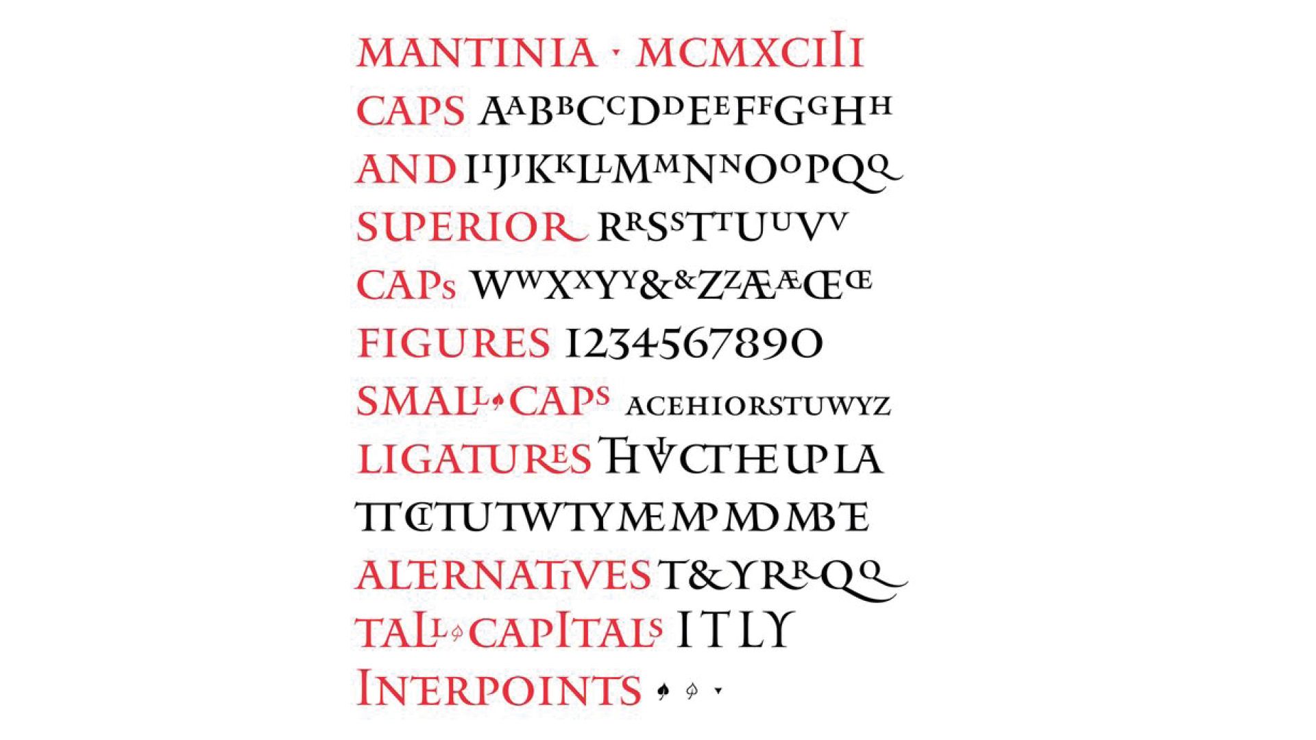
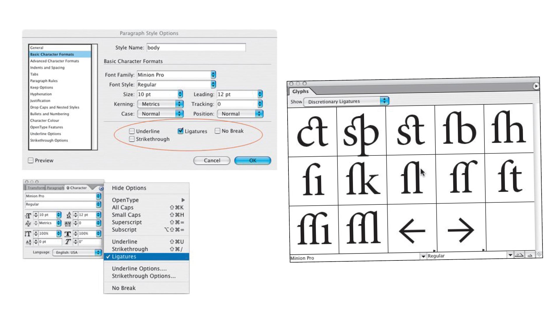
Matthew Carter (1937-) is one of a handful of type designers whose work crosses techniques and computer standards. After his apprenticeship at the Enschedé foundry, he began engraving punches. He went on to design typefaces for Linotype, then phototypesetting, and finally the computer. In 1993, Carter began designing Mantinia, a typeface inspired by Renaissance lapidary engraving, available only in capital letters. However, intended to be married with Galliard (1978), Carter exploited his epigraphic sources and included an extended set of typefaces. A few taller capitals coexist with a vast set of 16 ligatures, as well as superscript letters allowing the creation of ligatures in the counterform of the L. Initially, the composition of a text with ligatures is done by manually substituting the group of characters with the corresponding ligature. A printed manual lists the ligatures and their corresponding keyboard shortcuts. The more ingenious will use search-and-replace functions to automate the operation without errors. Subsequently, the software will provide a palette of glyphs to facilitate visualization of the characters available within the digital font.
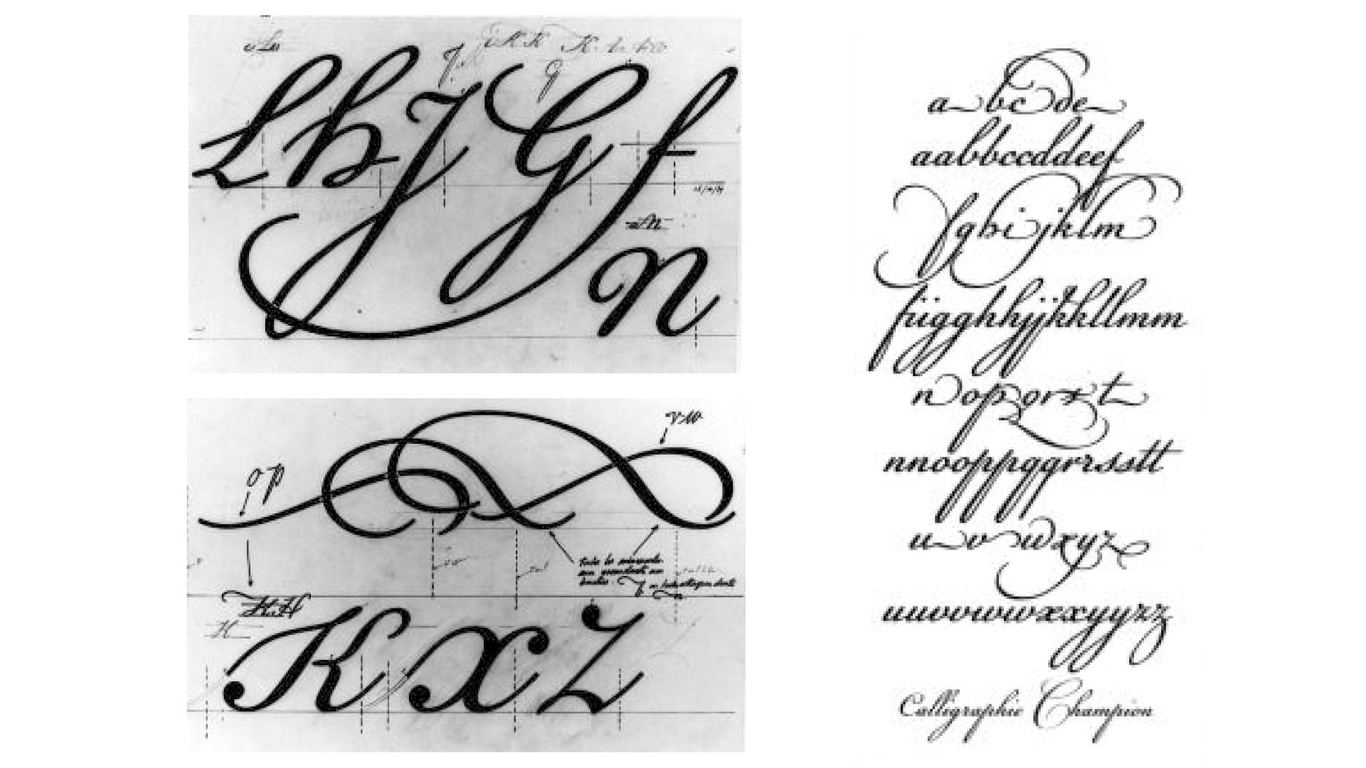
Another, more circuitous option was found in 1989 by French type designer François Boltana (1950-1999). With his Champion typeface family, he wanted to bring back to life the handwriting of English calligrapher Joseph Champion (1709-1765). After digitizing and redesigning all the typefaces, he ended up with a vast collection of alternative forms and ligatures. Stéphane Mailliard (a former Beaux-Arts student turned type designer) provides Boltana with computer assistance. He suggested that Boltana convert his Type 3 typographic file to Type 1, so that it could be used via an XTension in Quark XPress, the benchmark layout software of the time. This gave the designer an extended glyph palette on which the software's extension automatically made substitutions. The typography won numerous awards in Japan and the USA (1990) as well as in France (1991), and the name "computer calligraphy" proposed by its author was only the first step in the development of future standards.
Thanks to the computer, the keyboard was no longer seen as a limitation, but as a peripheral device to be circumvented. The TrueType format, dominant at the time, only allowed a set of 256 glyphs, just enough to include capitals, lower-cases, punctuation, numerals and the diacritics necessary for extended Latin. However, classic ligatures such as ff, fi, ffi, fl and ffl are only available if certain boxes are free and if the designer makes the substitution himself. The TrueType GX format was launched in 1994 to include a system for interpolating along an axis (e.g. weight, width, slant), but also to enable the substitution of a group of characters into a dedicated character: ligatures thus regained their power. However, software was slow to adopt the standard, and few typefaces were adapted to the new file format. That same year, out of the ashes of the GX format, a TrueType Open format was developed by Microsoft, quickly followed by Adobe in 1996, giving birth to the Open Type format. The format's many specific features include encapsulation of TrueType and PostScript Type 1 data, and compatibility between operating systems (Microsoft Windows, Mac OS, Unix/Linux). There's also a 65,536-character character set, enabling the inclusion of multiple writing systems and numerous alternative glyphs within a single file, as well as advanced automatic substitution functions. Providing for alternative characters, such as historical forms or ligatures, becomes child's play: graphic designers need only click on a button on the palette of their page-layout software to replace their text with one of these functions.
Within the OpenType format, ligatures are classified according to three classes: discretionary ligatures (dlig) combining capitals, historical ligatures (hlig) taking up less frequent old forms, and standard ligatures (liga), i.e. the usual links with the f and more classic forms such as ct, cp, st and sp. It's up to the type designer to exploit these nomenclatures faithfully, or not. The code injected into the digital file indicates the ligature class, as well as the designated character sequence and the final substitution glyph. Also, in the digital age, ligature is not so much a group of consecutive linked characters, but a replacement of one group by a different unit. So it's easy to change the ;-) sequence by a character symbolizing the "wink" emoticon, even if the final result no longer represents our punctuation marks. With this contemporary use of the smartphone keyboard, the ligature leaves behind its imitation of handwriting, abandoning its ornamental or aesthetic richness, to take on, like the first cuneiform ligatures, the pictorial representation of a new idea.