By Sebastien Hayez. Published May 15, 2024
History of ligatures, part 1/2
Gestural ligatures: a concern for economy
Like textiles, which share its etymology, text is a weft of characters. On the thread of the line, letters are linked together, sometimes taking on the appearance of a glyph in its own right. The layout of each character is altered by the combinations, making it difficult to read: these are the ligatures.
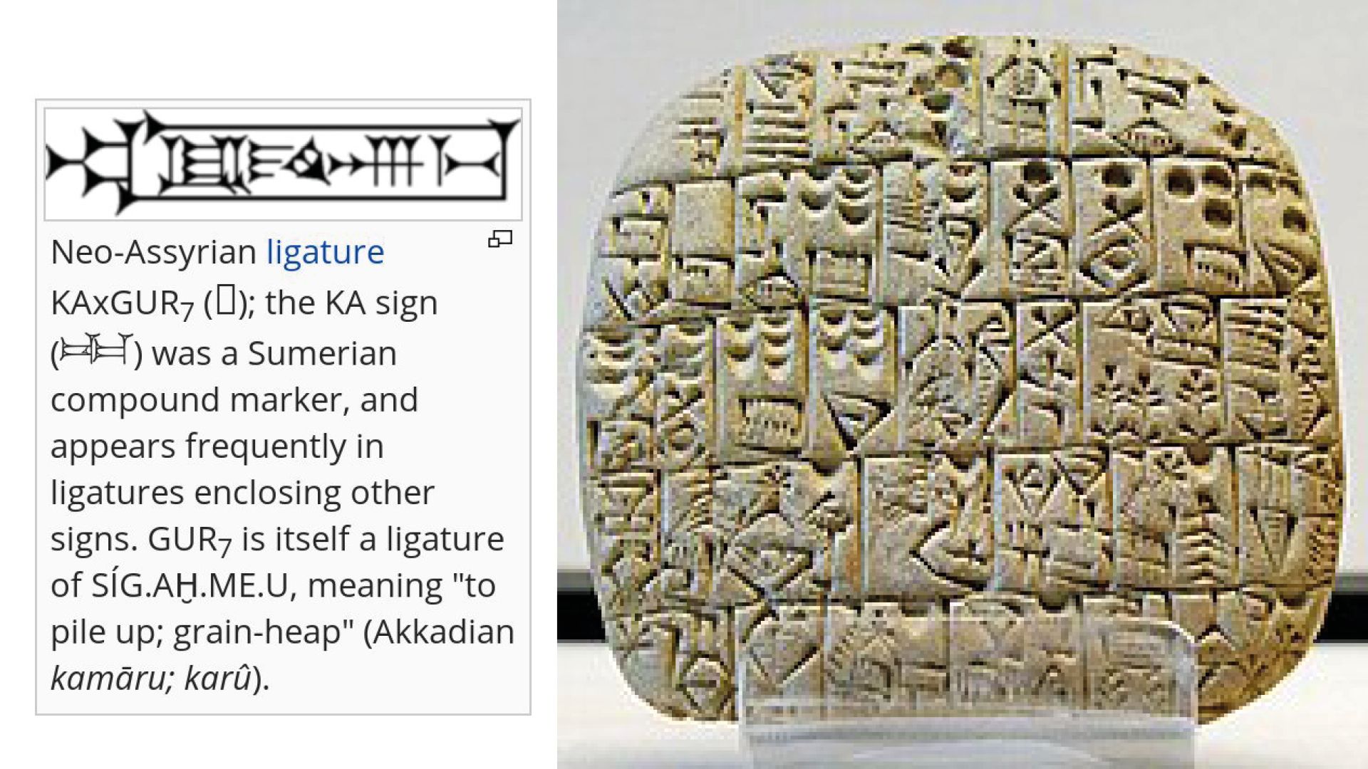
During Sumerian antiquity, cuneiform tablets (c. 3500 BC, c. 200 BC) may feature several characters side by side, rather than the usual spacing. The points of contact between these characters correspond to a common layout: the scribe saves himself a gesture by joining each character. If reading is assured, then saving both space and gesture saves writing and reading time. Later, these linked characters will take on their own autonomy to represent autonomous concepts. This is the advantage of ideographic or logo-syllabic writing systems, which allow for combinations of signs to create new ones.

This is not an isolated practice, since the Egyptians also knew these linked characters from texts composed in hieratic script (c. 3200/-3000, c. 650). While the reasons for this remain economy of gesture and space, the use of cut reed and ink on a sheet of papyrus makes gestures more fluid. Naturally, the faster the hand traces the characters, the less the calamus lifts off the support. Thus, the end of the ductus of the first character continues to give rise to the beginning of the second character.
This is most clearly demonstrated in Greek handwriting, where the numerous links between letters create a totally original ductus that is difficult for foreign readers to decipher.

Monogrammatic ligatures: abbreviations & emblems
However, in the Greek culture of the last few centuries BC, the same concern for economy gave rise to another type of ligature. Its beginnings are groups of letters accompanied by an superscribed line indicating the abbreviation, reducing writing and reading time, while ensuring easy deciphering by deduction or convention. This is how the first ancient monograms appeared.
For example, the Greek monogram tau-rho represents the number thirty, but also, by phonetic association, the Greek word stauros designating the cross. As for chi-rho, it symbolizes Greek words representing time (chronos), gold (khrusos) or a chiliarch (a command of a thousand men, khiliárkhês). Finally, these two monograms also appeared on Greek coins to designate foundry workshops, although the reasons for this choice are unknown. Their morphology, however, differs radically from that of the abbreviations with the superscript stroke. In fact, the letters are linked by certain conjoined segments, making them interdependent. The primary reason for this seems to be to save space on coins, but the resulting unity also brings them closer to the ligatured characters of Sumerian cuneiform. As early as the 2nd century, such signs were also found on Roman coins symbolizing the names of Emperors.

Various christian monograms (end of 2nd century, carved on jewels mounted on rings.
The first Christians used monograms for a very different purpose from the Greeks. Like the Greeks, the Christian monogram uses the initial, terminal and sometimes medial letters of a word to contract it, with the superscribed stroke attesting to this role. But it's also based on the Hebrew tetragrammaton YHWH, symbolizing the name of God.
Unpronounceable to preserve one's divine status, it also became a strong community sign. As early as the end of the first century, Greek Christians would have adopted this practice to show their Jewish ethnic roots. Nomina sacra are Christian monograms abbreviating sacred names into a group of superscribed letters.
Another practice consists in superimposing several letters, thus forging a single symbol. To this day, this contraction remains the most effective, both mnemonically and graphically.

Thus, when Christians wish to designate holy words, several spellings are possible: the spelled-out one, the nomina sacra or one of the monograms designating Christ.
The ancient and later medieval monogram is made up of all the letters of a person's name tied together to form a single graphic sign. The spread of the Christian cult from North Africa to the Mediterranean basin spread the image of the chi-rho, the victorious symbol of Christ, on coins, milestones, official buildings, religious stained glass windows and sarcophagi.
Ancient monograms were to represent only proper nouns and no longer word abbreviations. However, their aesthetics and capacity for contraction also echo another practice of Roman culture.
Read our previous article on the monograms here.


Roman ligatures: lapidary ornaments
Roman lapidary writing prefers to truncate certain endings, sometimes leaving only the initial, in order to save time and space on the stone. As reading is difficult for some readers, it's important to save space and to preserve letters.
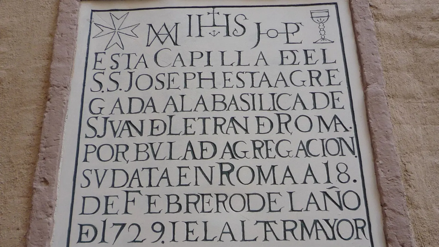
During the first centuries of Christianity, lapidary engravers took up the principle of ligature used in the monogram, while preserving the basic line of the letters. Several operations are possible to create a ligature.

Overlapping: two or more letters overlap, but the morphology of each letter is respected (equivalent to negative lettering).
Merging: identical segments between two letters are pooled. The letters touch, making reading more difficult as they appear as a single sign.
Interlocking: the counter-form of a letter allows another letter to be inscribed.
These sets of ligatures also prevent words from being cut off, and make it easier to manage the forced justification of text. Their decorative aspect makes them frequent inscriptions on prestigious architecture.
The English term for this type of ligature, discretionary, shows that the choice of these letter connections is left to the engraver's discretion, since no sign alters the meaning of the text.
In 1876, German paleographer Karl Zangemeister drew up a survey of the letters found in the city of Pompeii, buried in 79 CE by the ashes of Mount Vesuvius. Engraved Roman capitals are frequently abbreviated in the form of ligatures: AED, MP, UL, HE, TI, IMI, VE, VVB. Rustica calligraphy combines AE, AED, MAED, ED, ND, ONORUM, OVF, VIR. Even more inventive are the graffiti on walls, drawn in point form, combining : ANTH, HA, HU, NTH, PH, PHI, VA and US. Within Roman cursive, ligatures are numerous, and the most frequent are et, er and ex, as well as ge and ti.

Typographic ligatures: faithful to the hand
To this day, these two types of ligatures coexist side by side: cursive ligatures link letters together with a common stroke, while discretionary ligatures link capitals in a skilful interlocking game.
Ligatures sometimes retain a linguistic role as logograms. In the Middle Ages, for example, the ligatures Æ and Œ appeared, formed from the ligature of two letters and symbolizing the Latin diphthongs ae and oe. They gradually acquired letter status in a number of languages, including Danish, Norwegian, Icelandic and Faroese.
Gothic calligraphy, which gradually appeared around the 12th century, is a broken script with angular strokes and a relatively narrow kerning. Its dense, ornate capitals do not lend themselves to discretionary ligatures, since they are only used for initial capital letters. On the other hand, in its cursive and formal forms, it retains, as it has since Antiquity, a skilful set of ligatures expressing the abbreviations necessary for good copyist performance.

The most common ligatures in Gothic script are those combining two letters with identical stem. Thus, the right-hand verticals of b, o or p can be married to the left-hand verticals of c, e, o, d, g and q. This means bringing the letters closer together until they touch, provided this doesn't interfere with the correct reading of the text.
When the 42-line Bible by Gutenberg (1400-1468) appeared in 1455, the challenge was to industrially produce printed books that faithfully reproduced handwriting. To achieve this, Gutenberg perfected the press, then developed a metal alloy to melt the movable type he had imagined. In all, some 290 dies were used to cast 15,600 movable type characters. These included 53 capitals and 158 lower-case letters with and without overprint, 79 ligatures, four abbreviations (notably for us and orum), and five punctuation marks”, as well as “linking letters designed to blend well with their left-hand neighbor in the form of a gallows. Ligatures can be created by punching two characters from the same punch if the letters are simply adjacent. If the connection between the characters differs too much, an independent matrix must be engraved by hand.
