Inferi
Details
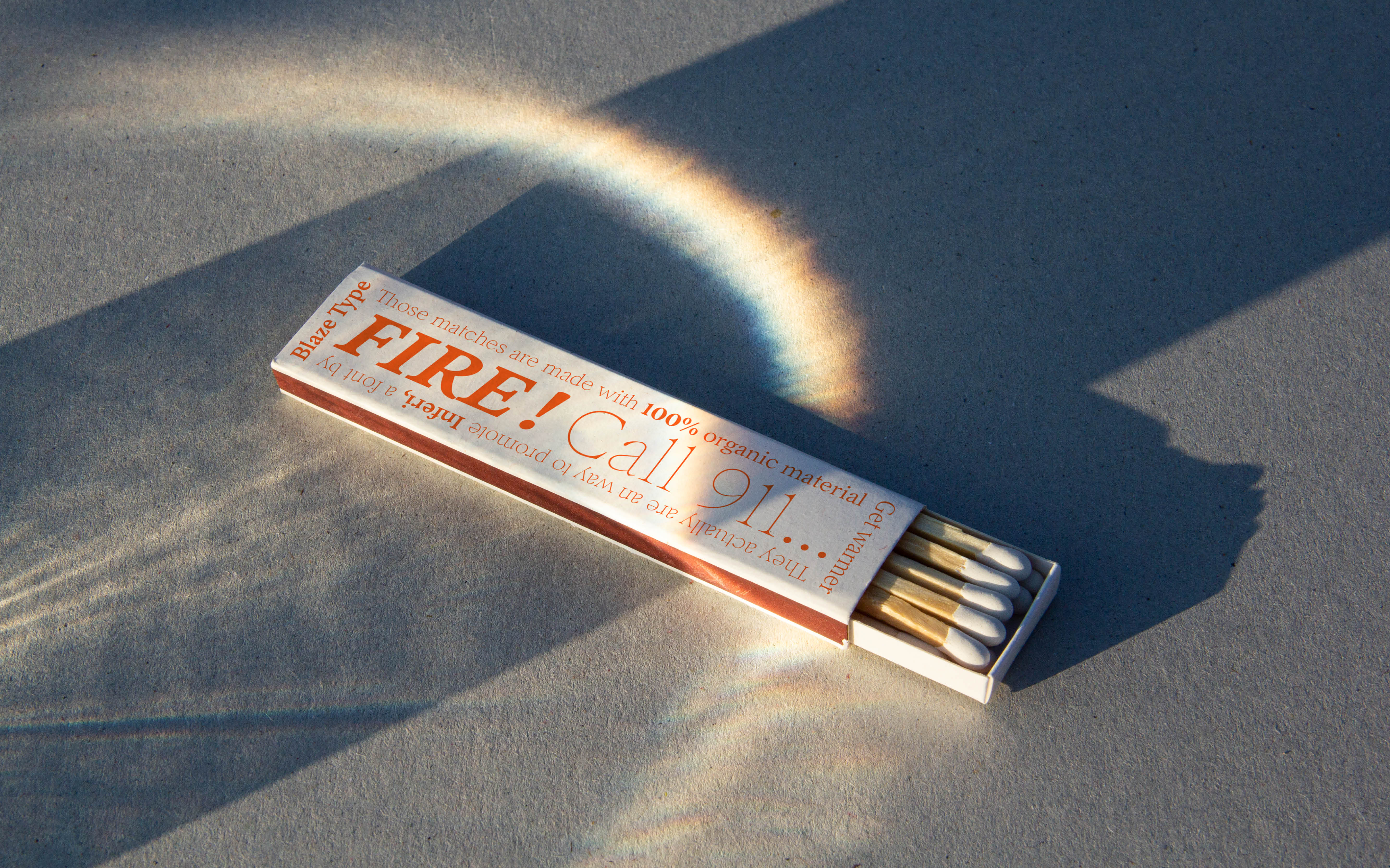
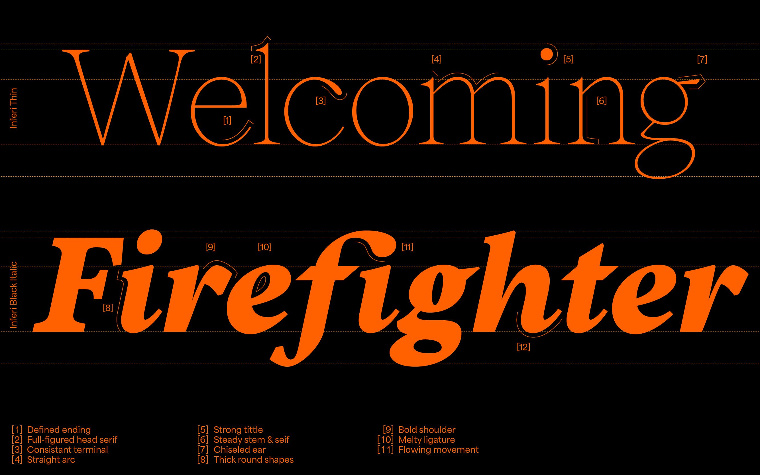
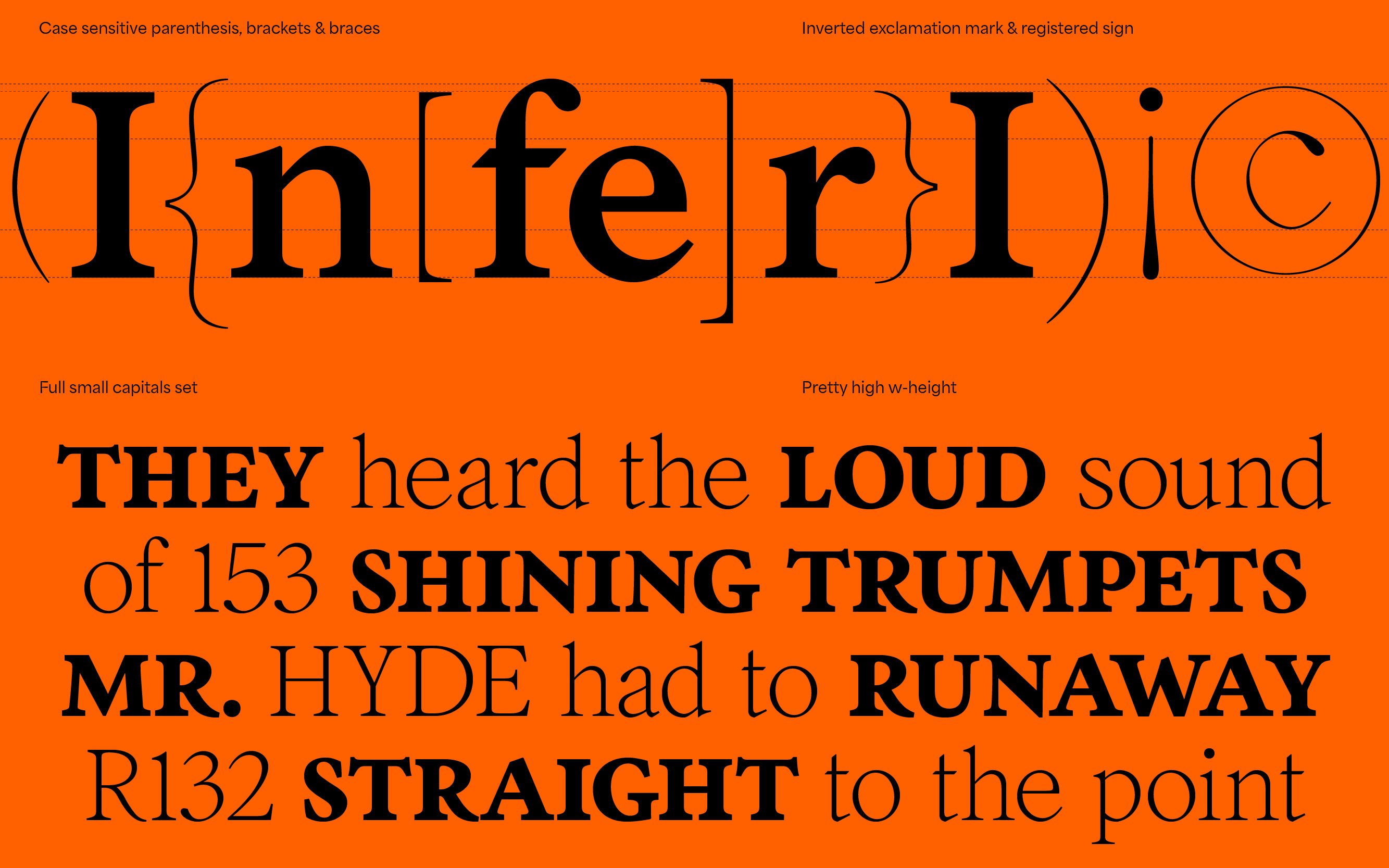
Inferi takes its roots in Garalde print like fonts. With its defining features, like squared edges and print letterform it covers a large panel of uses. It has been designed in various styles and weights, allowing one to have an extensive type-tool for any kind of usage. Whether the need would be on book design, poster design or editorial uses, Inferi will be a nice fit to complex type-shaping. If your goal is to reach for a printed-type feeling on digital medium (websites, apps and such), you will find Inferi to be your tool of choice.
A well balanced family with squared edges and round finishes in the roman version, the italics cut deep into a more modern approach. Drawn with a careful “hand style” touch. A nice balance for complex layouts as the print style form and the optical grey between roman and italics version will allow for great legibility.
- Designed by
- Matthieu Salvaggio
- Released in
- 2021
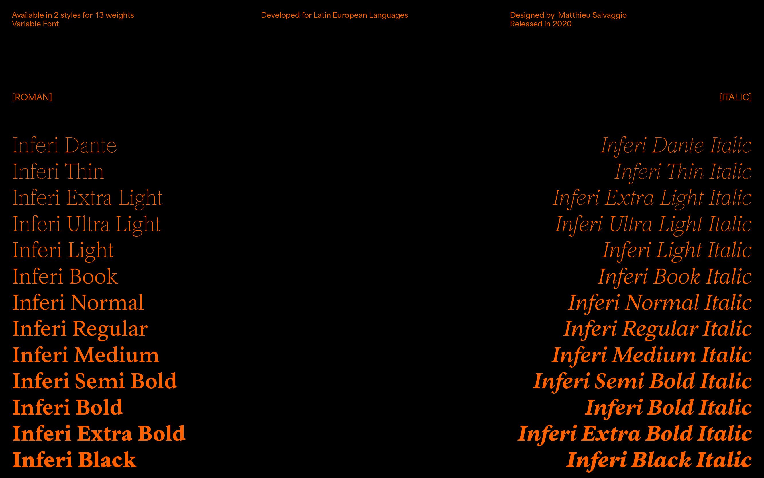
- Styles
- Serif, Display, Text, Upright, Italic
- Export
- .OTF .WOFF .WOFF2 .TTF (Variable)
- Developed for
- Latin European Languages
Afrikaans, Albanian, Asu, Basque, Bemba, Bena, Bosnian, Catalan, Cebuano, Chiga, Colognian, Cornish, Corsican, Croatian, Czech, Danish, Dutch, Embu, English, Esperanto, Estonian, Faroese, Filipino, Finnish, French, Friulian, Galician, Ganda, German, Gusii, Hungarian, Icelandic, Ido, Inari Sami, Indonesian, Interlingua, Irish, Italian, Javanese, Jju, Jola-Fonyi, Kabuverdianu, Kalaallisut, Kalenjin, Kamba, Kikuyu, Kinyarwanda, Kurdish, Latvian, Lithuanian, Lojban, Low German, Lower Sorbian, Luo, Luxembourgish, Luyia, Machame, Makhuwa-Meetto, Makonde, Malagasy, Malay, Maltese, Manx, Maori, Meru, Morisyen, North Ndebele, Northern Sami, Northern Sotho, Norwegian Bokmål, Norwegian Nynorsk, Nyanja, Nyankole, Occitan, Oromo, Polish, Portuguese, Romanian, Romansh, Rombo, Rundi, Rwa, Samburu, Sango, Sangu, Sardinian, Scottish Gaelic, Sena, Shambala, Shona, Sicilian, Slovak, Slovenian, Soga, Somali, South Ndebele, Southern Sotho, Spanish, Swahili, Swati, Swedish, Swiss German, Taita, Taroko, Teso, Tsonga, Tswana, Turkish, Turkmen, Upper Sorbian, Vunjo, Walloon, Walser, Welsh, Western Frisian, Wolof, Xhosa, Zulu
- Dante
- Dante Italic
- Thin
- Thin Italic
- Extra Light
- Extra Light Italic
- Ultra Light
- Ultra Light Italic
- Light
- Light Italic
- Book
- Book Italic
- Normal
- Normal Italic
- Regular
- Regular Italic
- Medium
- Medium Italic
- Semi Bold
- Semi Bold Italic
- Bold
- Bold Italic
- Extra Bold
- Extra Bold Italic
- Black
- Black Italic
Font features
Font features
Font features
Font features
Font features
Font features
Font features
Font features
Font features
Font features
Font features
Font features
Font features
Font features
Font features
Font features
Font features
Font features
Font features
Font features
Font features
Font features
Font features
Font features
Font features
Font features
Cookie Consent We use cookies to provide you with the best possible experience. They also allow us to analyze user behavior in order to constantly improve the website for you. Privacy Policy