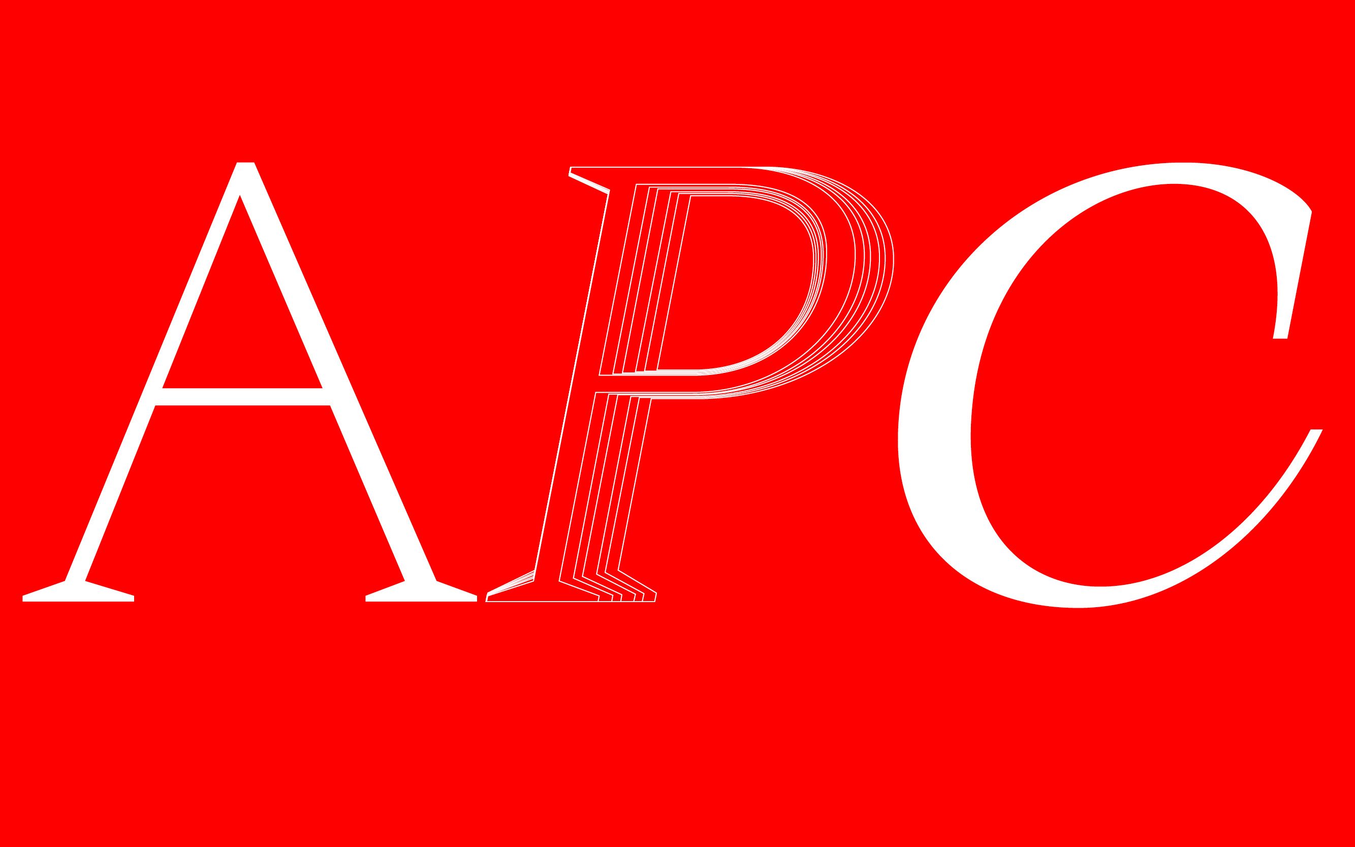
Apoc
Details
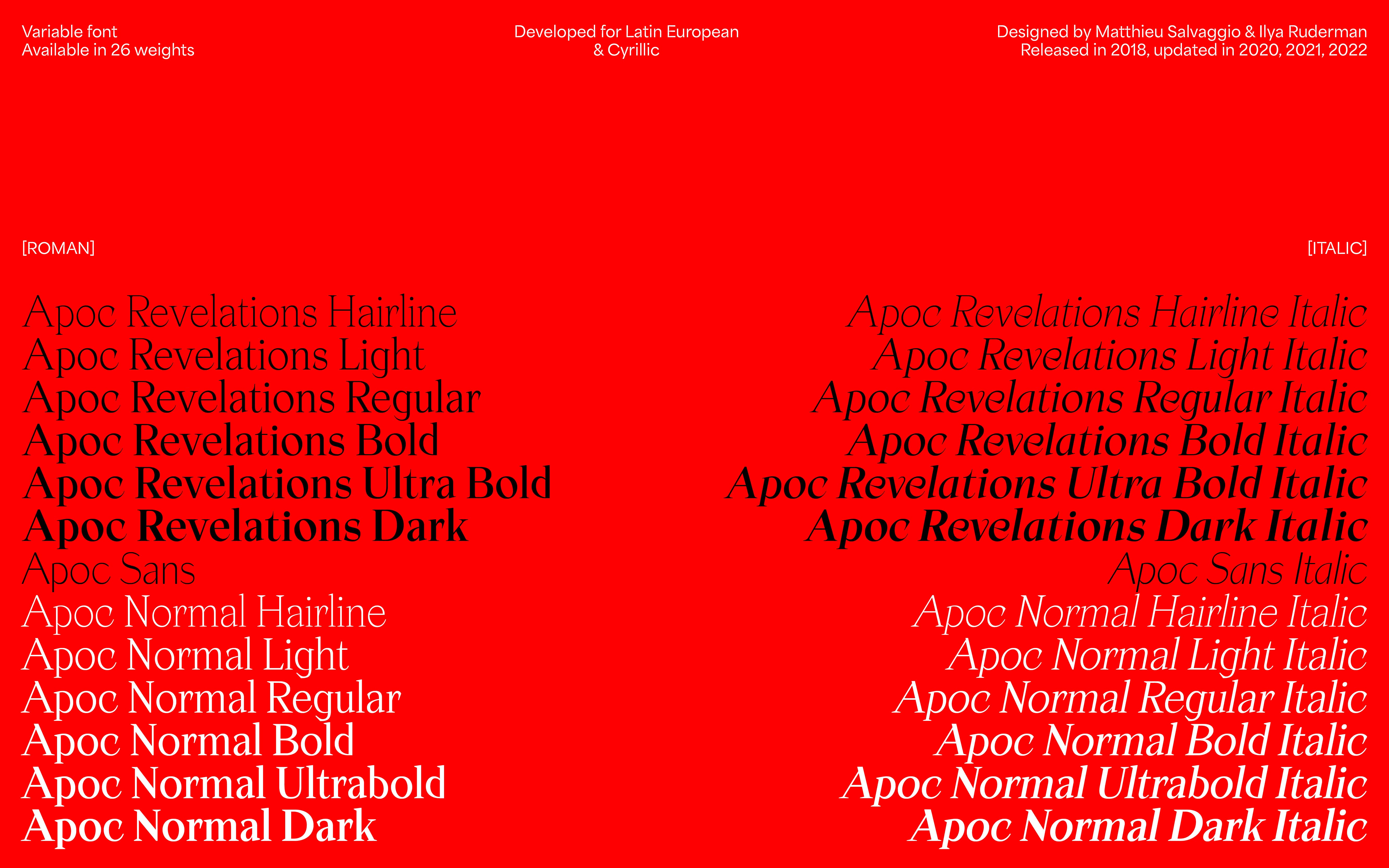
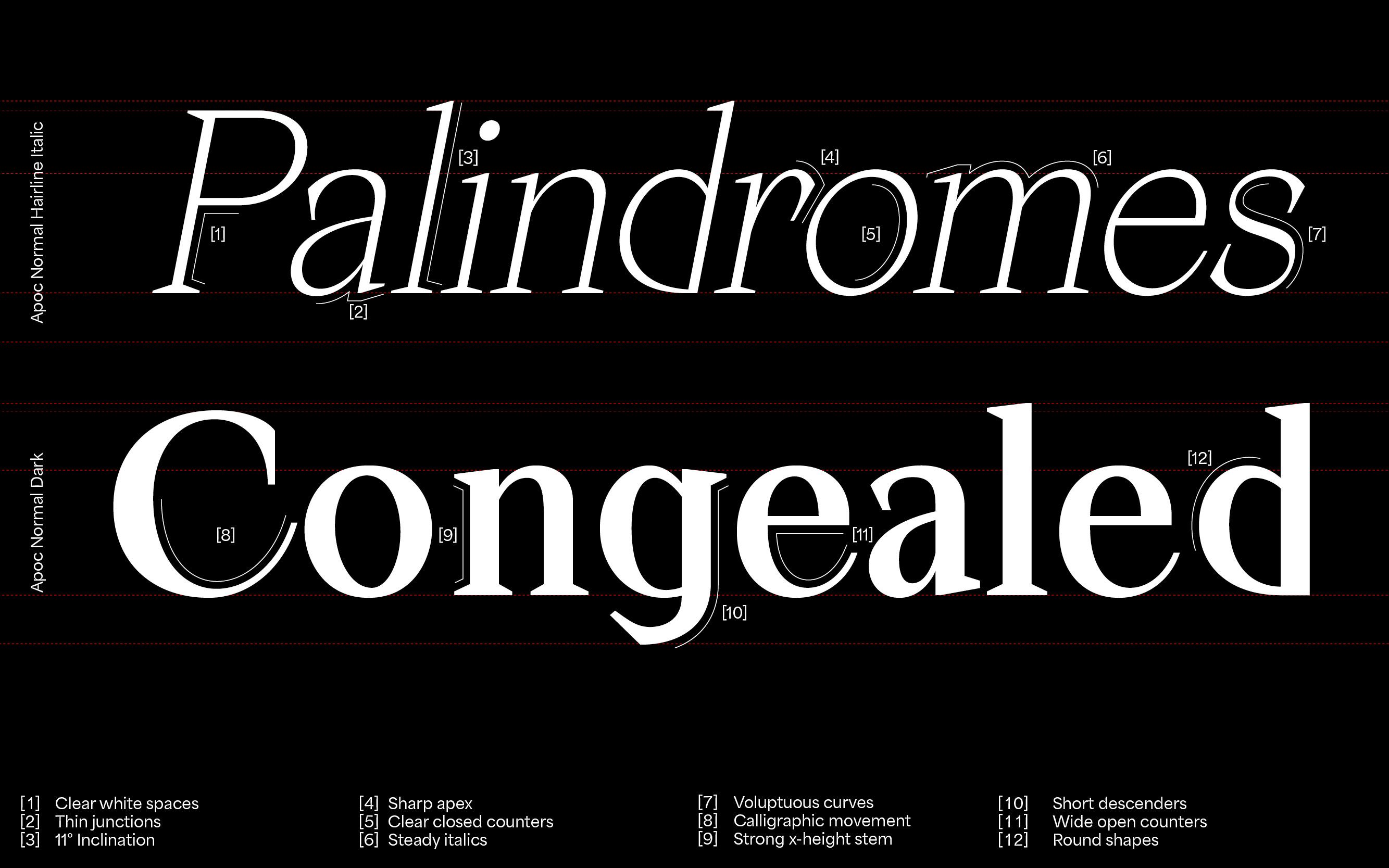
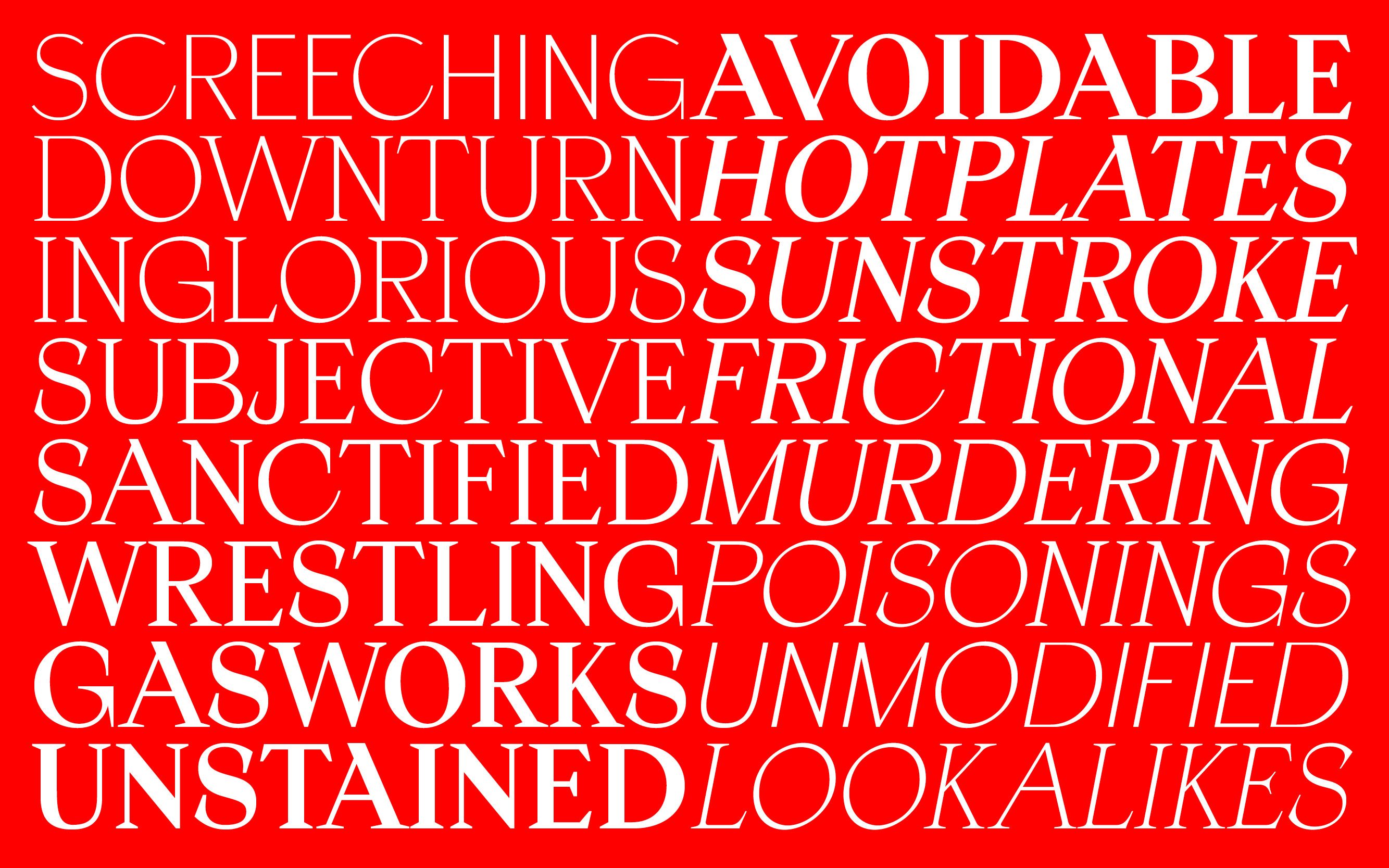
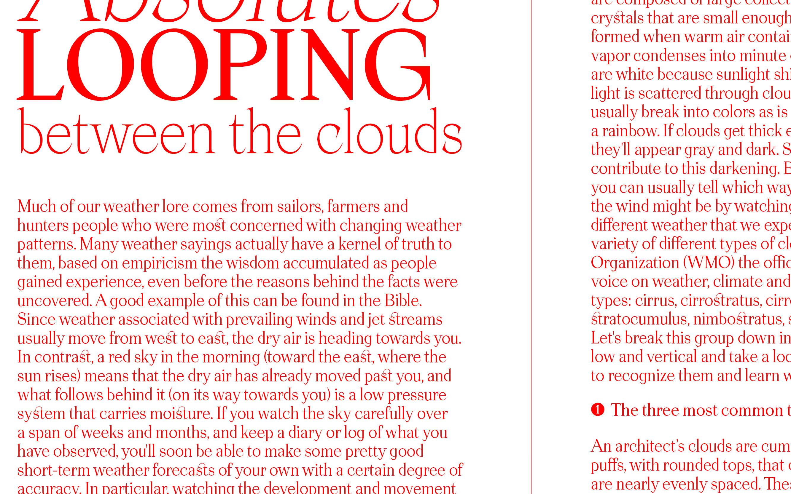
Apoc embodies the battle between Light and Dark. Apoc(alypse)'s sharp character set & alternates were released in 2018 and updated in 2020 & 2022 by Matthieu Salvaggio. Cyrillic languages were designed by Ilya Ruderman (Tomorrow Type). Defined by designers as the most popular typeface of standout contemporary independent design, Apoc is an elegant, sharp, expressive font family, perfect for bold standout displays focusing on heavy font uses.
This font is perfectly suited to sharpen your website headlines, art exhibition's posters or even your album covers.
- Designed by
- Matthieu Salvaggio, Tomorrow Type
- Released in
- 2018
- Styles
- Serif, Sans, Display, Text, Upright, Italic
- Export
- .OTF .WOFF .WOFF2 .TTF (Variable)
- Developed for
- Latin European and Cyrillic
Abaza, Abkhaz, Adyghe, Afar, Afrikaans, Aghul, Albanian, Altai, Aranese, Aromanian, Avar, Aymara, Azeri (Cyrillic), Azeri (Latin), Balkar, Bashkir, Basque, Belarusian, Bemba, Bislama, Bosnian, Breton, Bulgarian, Buryat, Catalan, Chamorro, Chechen, Cheyenne, Chichewa, Chokwe, Chukcha, Chuukese, Chuvash, Cofán, Cornish, Crimean Tatar, Croatian, Cyr, Czech, Danish, Dargin, Dolgan, Dungan, Dutch, Enets, English, Esperanto, Estonian, Even, Evenki, Faroese, Fijian, Finnish, French, Frisian, Friulian, Ga, Gagauz, Galician, Ganda, German, Gikuyu, Greenlandic, Gwich’in, Haitian, Hawaiian, Hungarian, Icelandic, Ido, Igbo, Indonesian, Ingush, Interlingua, Irish Gaelic, Italian, Itelmen, Javanese, Kabardian, Kalmyk, Karakalpak, Karelian, Kashubian, Kazakh, Khanty, Kildin Sami, Kinyarwanda, Kirghyz, Kiribati, Kirundi, Kituba, Komi, Kongo, Koryak, Kumyk, Kurdish, Kwanyama, Ladin, Lak, Latvian, Lezgian, Lingala, Lithuanian, Luxemburgish, Macedonian, Malagasy, Malay, Maltese, Manci, Maninka, Manx, Māori, Mari, Marshallese, Moldovan, Mongolian, Montenegrin, Mordvin (Erzya), Mordvin (Moksha), Náhuatl, Nanai, Nauruan, Navajo, Ndebele (Northern), Ndebele (Southern), Nenets, Nganasan, Nivkh, Nogai, Norn, Norwegian, Nyanja, Occitan, Oromo, Ossetic, Otomi, Palauan, Pedi, Polish, Portuguese, Quechua, Rarotongan, Rhaeto-Romanic, Romaji, Romani, Romanian, Russian, Rusyn, Rutul, Sámi (Inari), Sámi (Lule), Sámi (Northern), Sámi (Southern), Sango, Sardinian, Scottish Gaelic, Selkup, Serbian, Seychelles Creole, Shona, Silesian, Slovak, Slovene, Somali (Latin), Sorbian, Sotho, Spanish, Swahili, Swati, Swedish, Tabasaran, Tagalog (Filipino), Tahitian, Tajik (Cyrillic), Tatar, Tetum, Tok Pisin, Tokelauan, Tongan, Tsonga, Tswana, Turkish, Turkmen, Tuvan, Twi, Udmurt, Ukrainian, Umbundu, Uzbek, Venda, Veps, Welsh, Wolof, Xhosa, Yakut, Yoruba, Zulu
- Hairline
- Hairline Italic
- Light
- Light Italic
- Regular
- Regular Italic
- Bold
- Bold Italic
- Ultra Bold
- Ultra Bold Italic
- Dark
- Dark Italic
- Hairline
- Hairline Italic
- Light
- Light Italic
- Regular
- Regular Italic
- Bold
- Bold Italic
- Ultra Bold
- Ultra Bold Italic
- Dark
- Dark Italic
- Light
- Light Italic
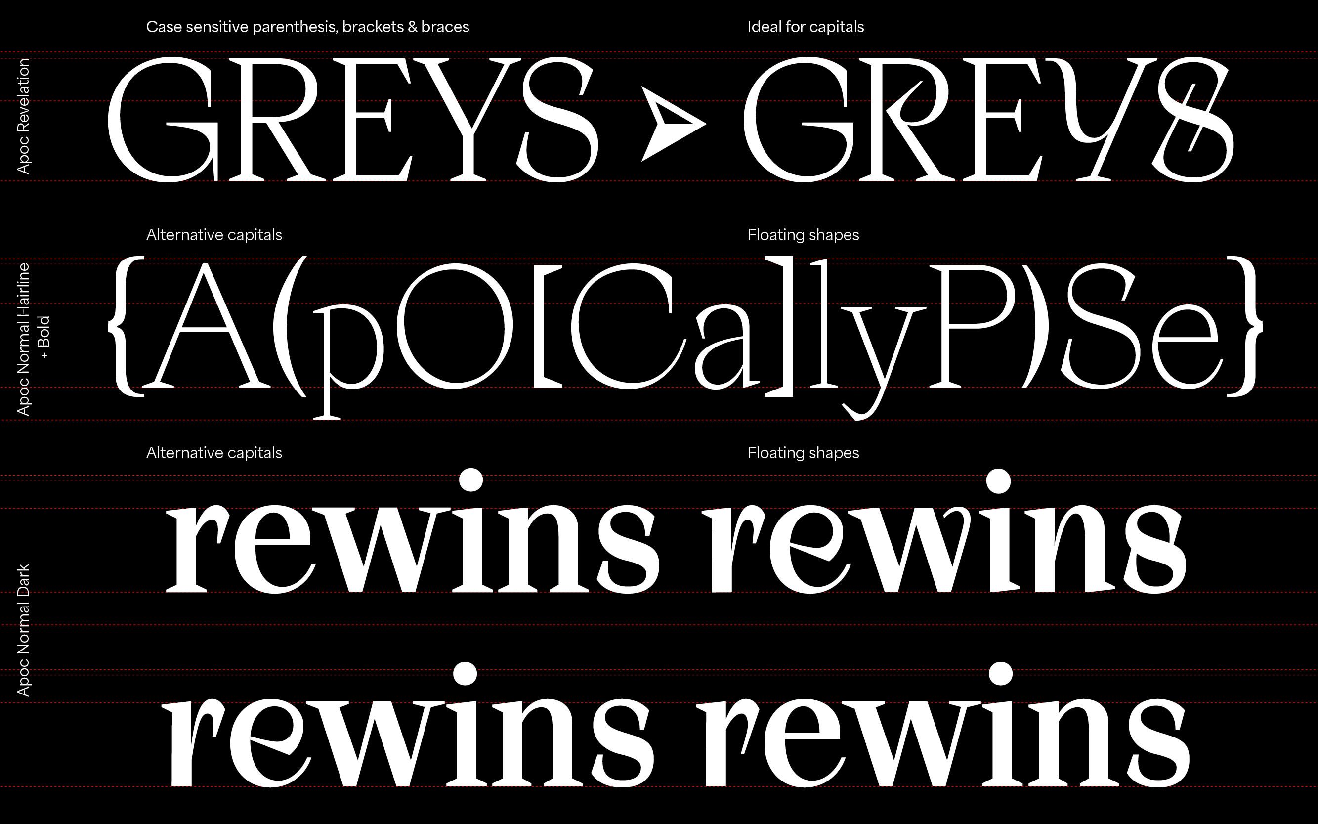
Figure Styles
Font features
Figure Styles
Font features
Figure Styles
Font features
Figure Styles
Font features
Figure Styles
Font features
Figure Styles
Font features
Figure Styles
Font features
Figure Styles
Font features
Figure Styles
Font features
Figure Styles
Font features
Figure Styles
Font features
Figure Styles
Font features
Figure Styles
Font features
Figure Styles
Font features
Figure Styles
Font features
Figure Styles
Font features
Figure Styles
Font features
Figure Styles
Font features
Figure Styles
Font features
Figure Styles
Font features
Figure Styles
Font features
Figure Styles
Font features
Figure Styles
Font features
Figure Styles
Font features
Figure Styles
Font features
Figure Styles
Font features

Cookie Consent We use cookies to provide you with the best possible experience. They also allow us to analyze user behavior in order to constantly improve the website for you. Privacy Policy