Mack
Details
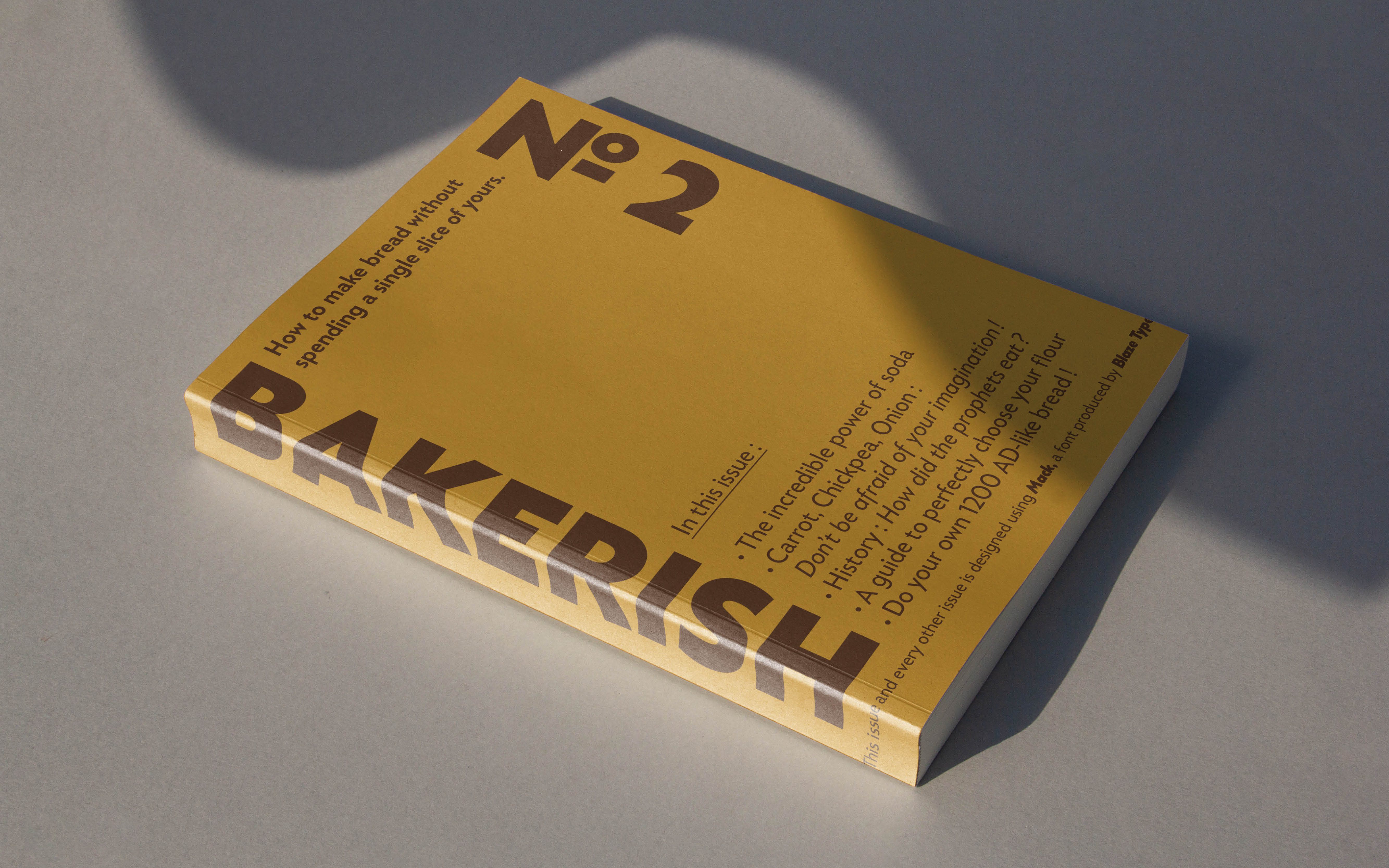
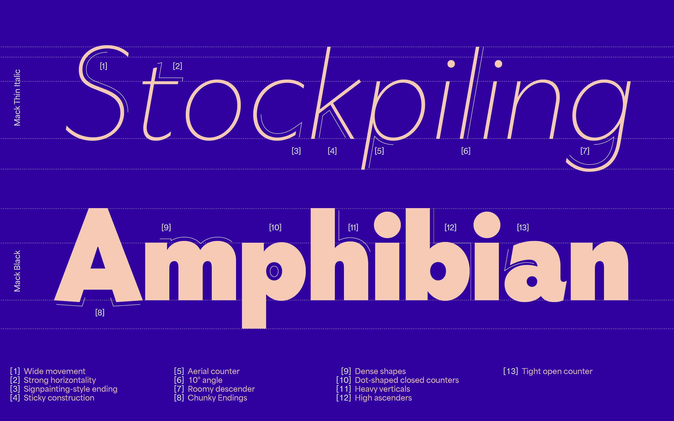
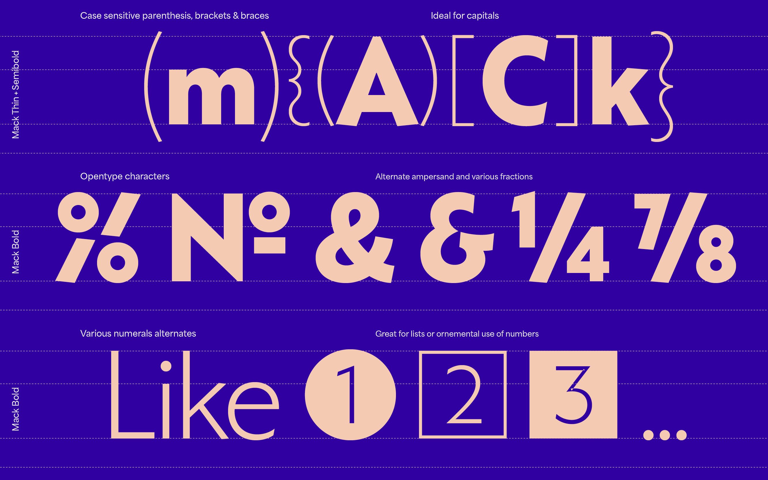
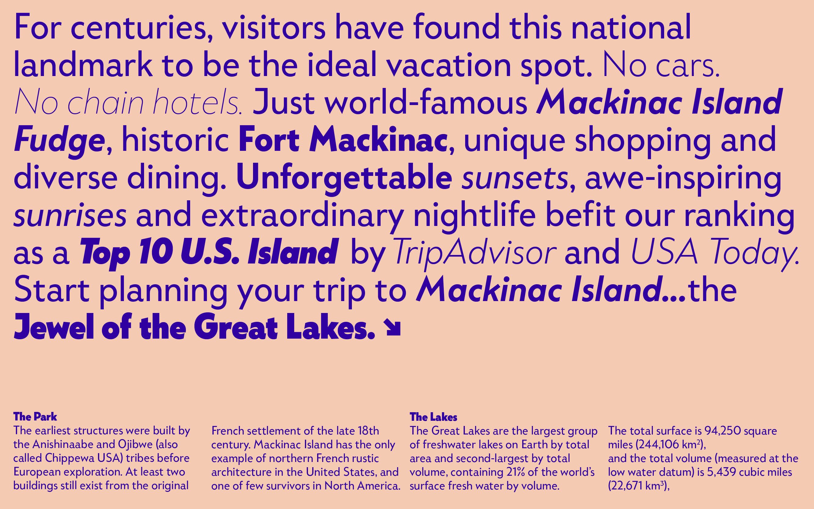
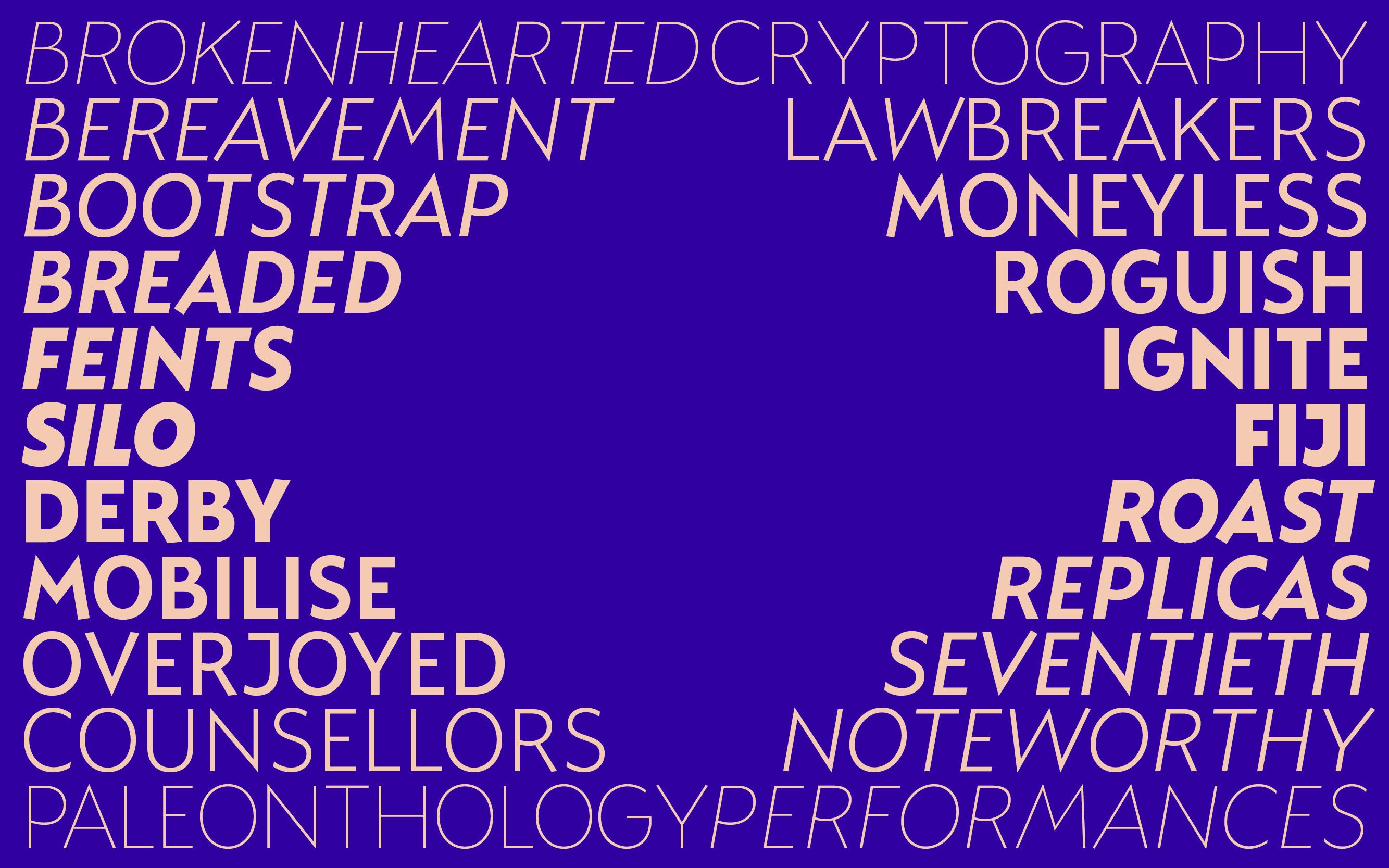
Mack is a humanist sans serif inspired by the natural, brush-made variations of details originally rooted in geometry. The spark for the creation of Mack came from lettering on a map of Mackinac Island whose angled terminals, pointed peaks, and variation of proportion were all details that set it apart from the strictly geometric forms it appears to reference. Rather than copying the few letters there and extrapolating them into a whole font, Mack is an original sans serif design following similar principles. Its structure and contrast resemble those of mid-century geometric typefaces while its curves and terminals are angled to emulate the stroke of a brush.
- Designed by
- Nathan Metzler, Matthieu Salvaggio
- Released in
- 2021
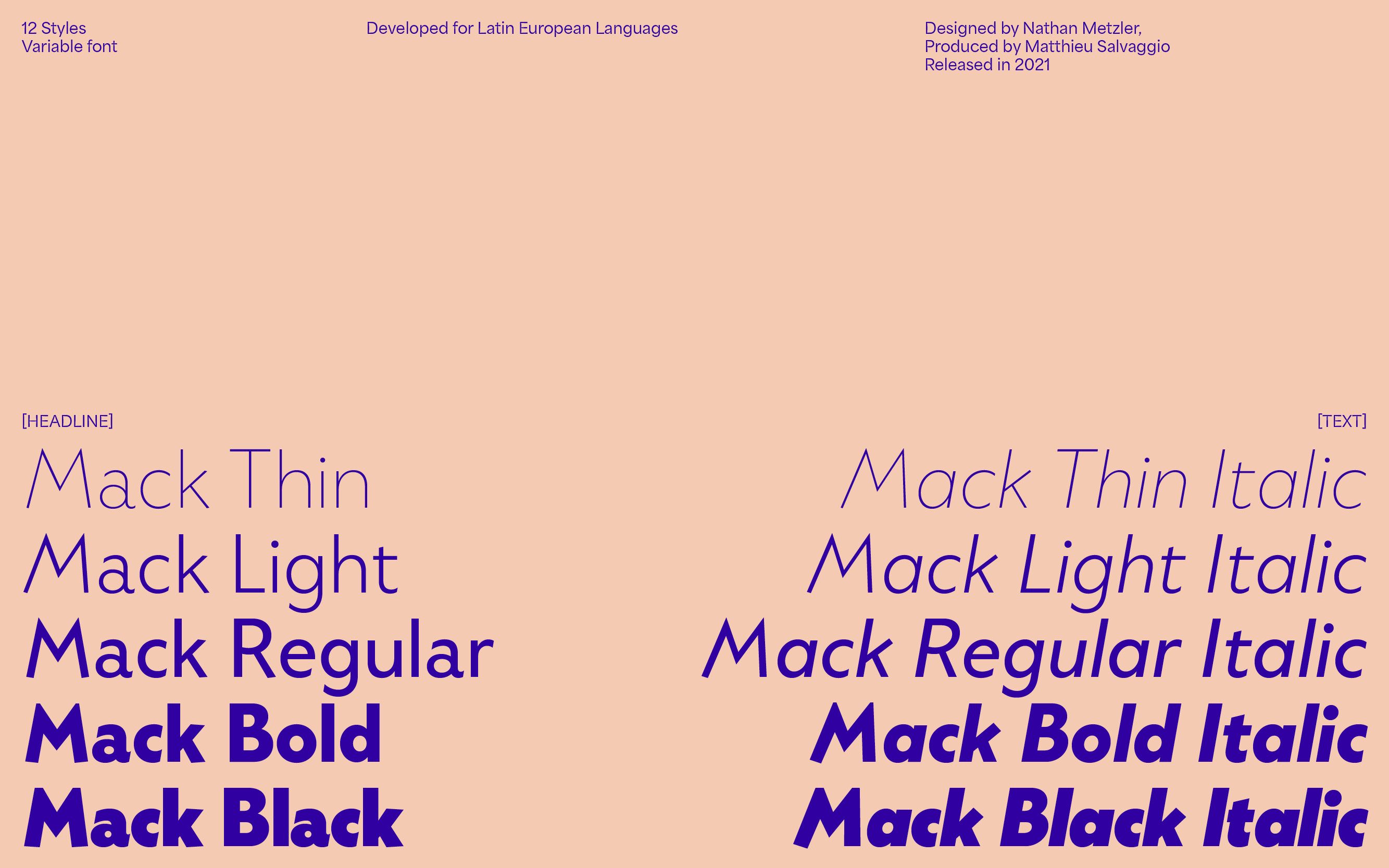
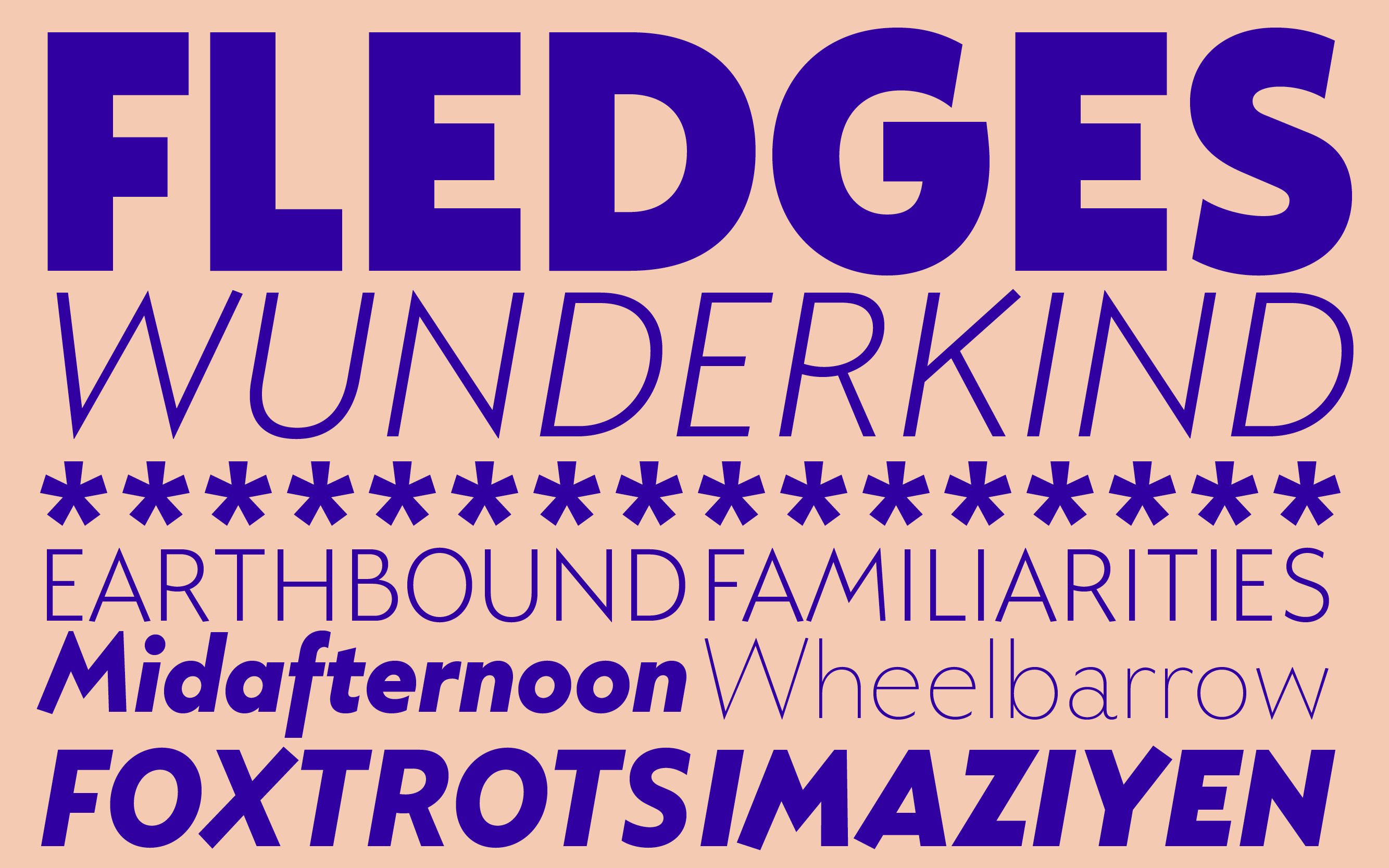
- Styles
- Sans, Display, Text, Upright, Italic
- Export
- .OTF .WOFF .WOFF2 .TTF (Variable)
- Developed for
- Latin European Languages
Afrikaans, Albanian, Asu, Basque, Bemba, Bena, Bosnian, Catalan, Cebuano, Chiga, Colognian, Cornish, Corsican, Croatian, Czech, Danish, Dutch, Embu, English, Esperanto, Estonian, Faroese, Filipino, Finnish, French, Friulian, Galician, Ganda, German, Gusii, Hungarian, Icelandic, Ido, Inari Sami, Indonesian, Interlingua, Irish, Italian, Javanese, Jju, Jola-Fonyi, Kabuverdianu, Kalaallisut, Kalenjin, Kamba, Kikuyu, Kinyarwanda, Kurdish, Latvian, Lithuanian, Lojban, Low German, Lower Sorbian, Luo, Luxembourgish, Luyia, Machame, Makhuwa-Meetto, Makonde, Malagasy, Malay, Maltese, Manx, Maori, Meru, Morisyen, North Ndebele, Northern Sami, Northern Sotho, Norwegian Bokmål, Norwegian Nynorsk, Nyanja, Nyankole, Occitan, Oromo, Polish, Portuguese, Romanian, Romansh, Rombo, Rundi, Rwa, Samburu, Sango, Sangu, Sardinian, Scottish Gaelic, Sena, Shambala, Shona, Sicilian, Slovak, Slovenian, Soga, Somali, South Ndebele, Southern Sotho, Spanish, Swahili, Swati, Swedish, Swiss German, Taita, Taroko, Teso, Tsonga, Tswana, Turkish, Turkmen, Upper Sorbian, Vunjo, Walloon, Walser, Welsh, Western Frisian, Wolof, Xhosa, Zulu
Mack Variable
- Thin
- Thin Italic
- Light
- Light Italic
- Regular
- Regular Italic
- Semibold
- Semibold Italic
- Bold
- Bold Italic
- Black
- Black Italic